Typography
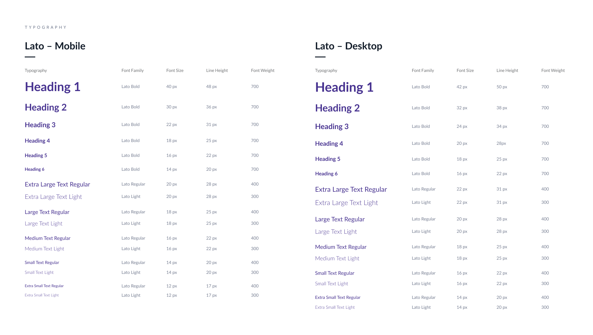
Lato, a versatile sans serif font, is known for its wide range of font weights, suitable for various heading and body text styles. Lato's adaptability ensures readability across different screen sizes.
Component library built to drive efficiency and consistency across the white label projects.
Lato, a versatile sans serif font, is known for its wide range of font weights, suitable for various heading and body text styles. Lato's adaptability ensures readability across different screen sizes.
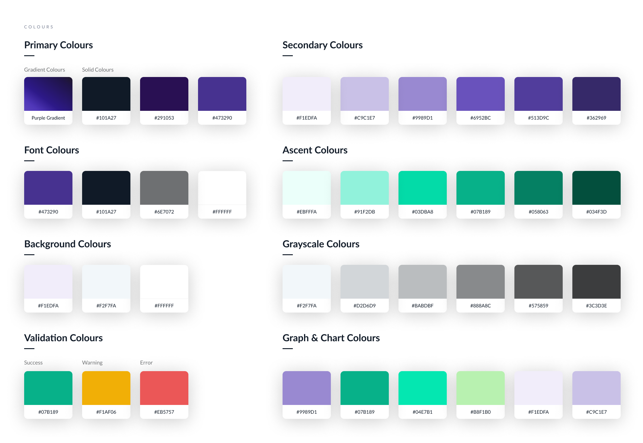
A detailed color palette was developed for illustrations, charts, and graphs. Secondary and accent colors were derived by adjusting the Hue, saturation & lightness (HSL) or Hue, saturation & brightness (HSB) values of brand colors, ensuring consistency and alignment with the brand's visual identity across illustrations.
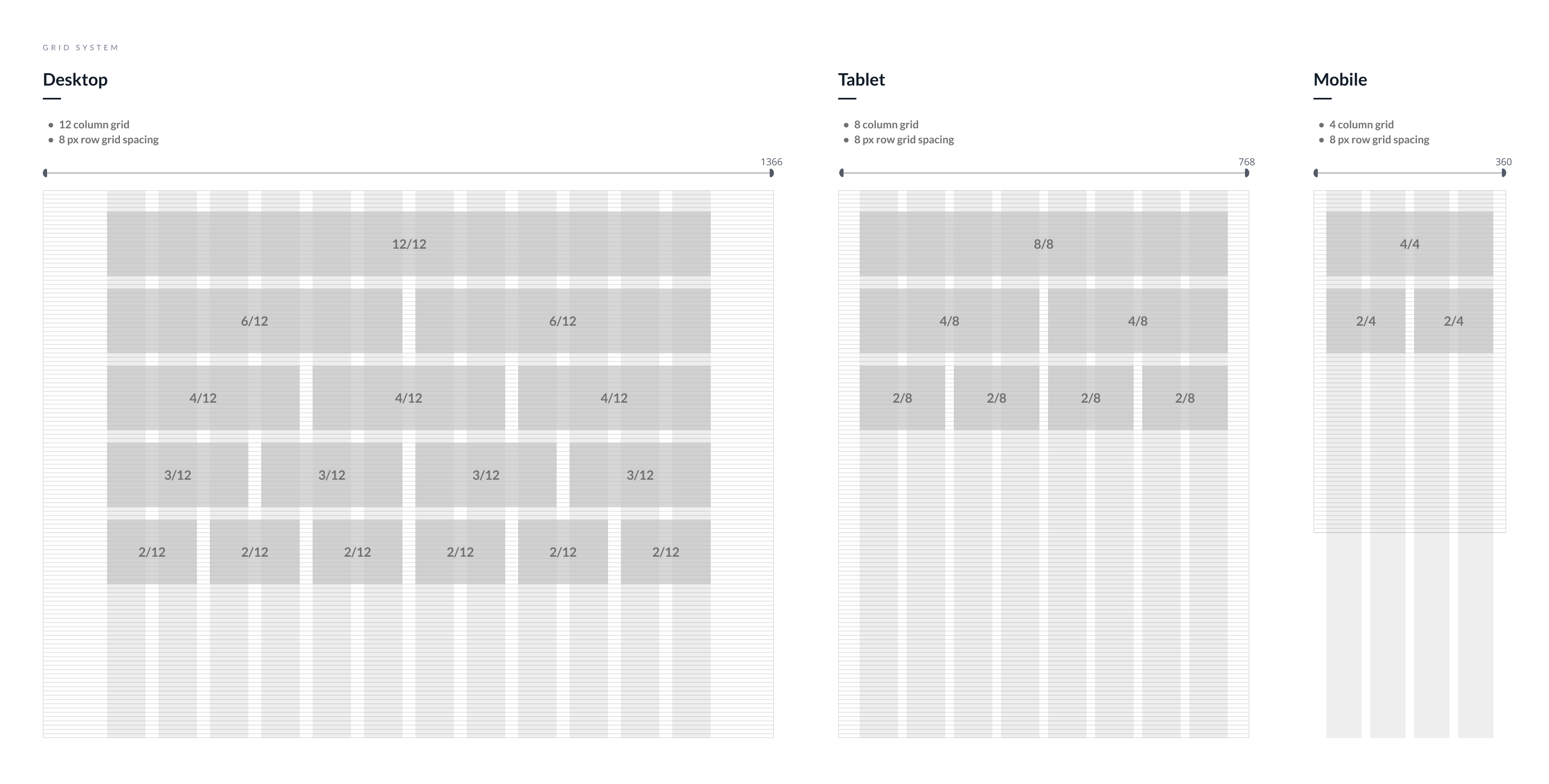
Following Material UI guidelines, an 8-point layout grid system was implemented to streamline design hand-off, ensuring consistency between designers and developers. This system, aligned with the divisibility of popular screen sizes by 8, ensures scalability.
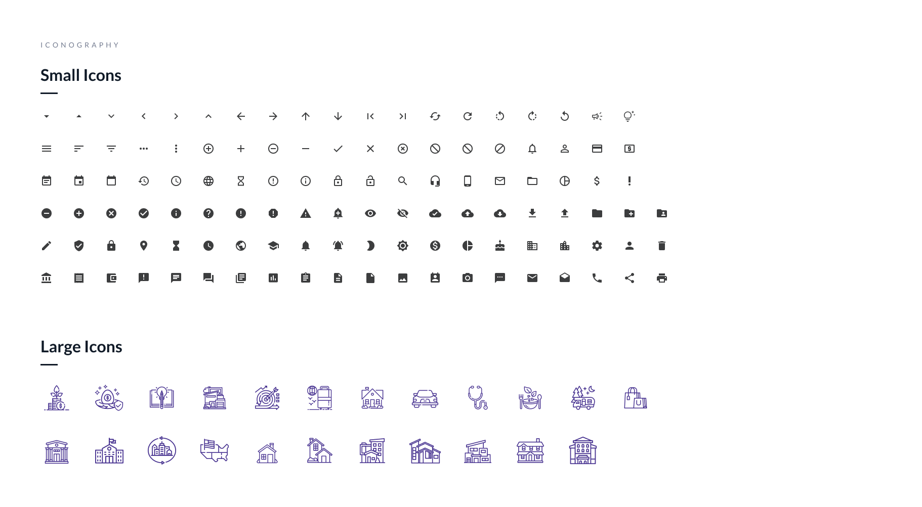
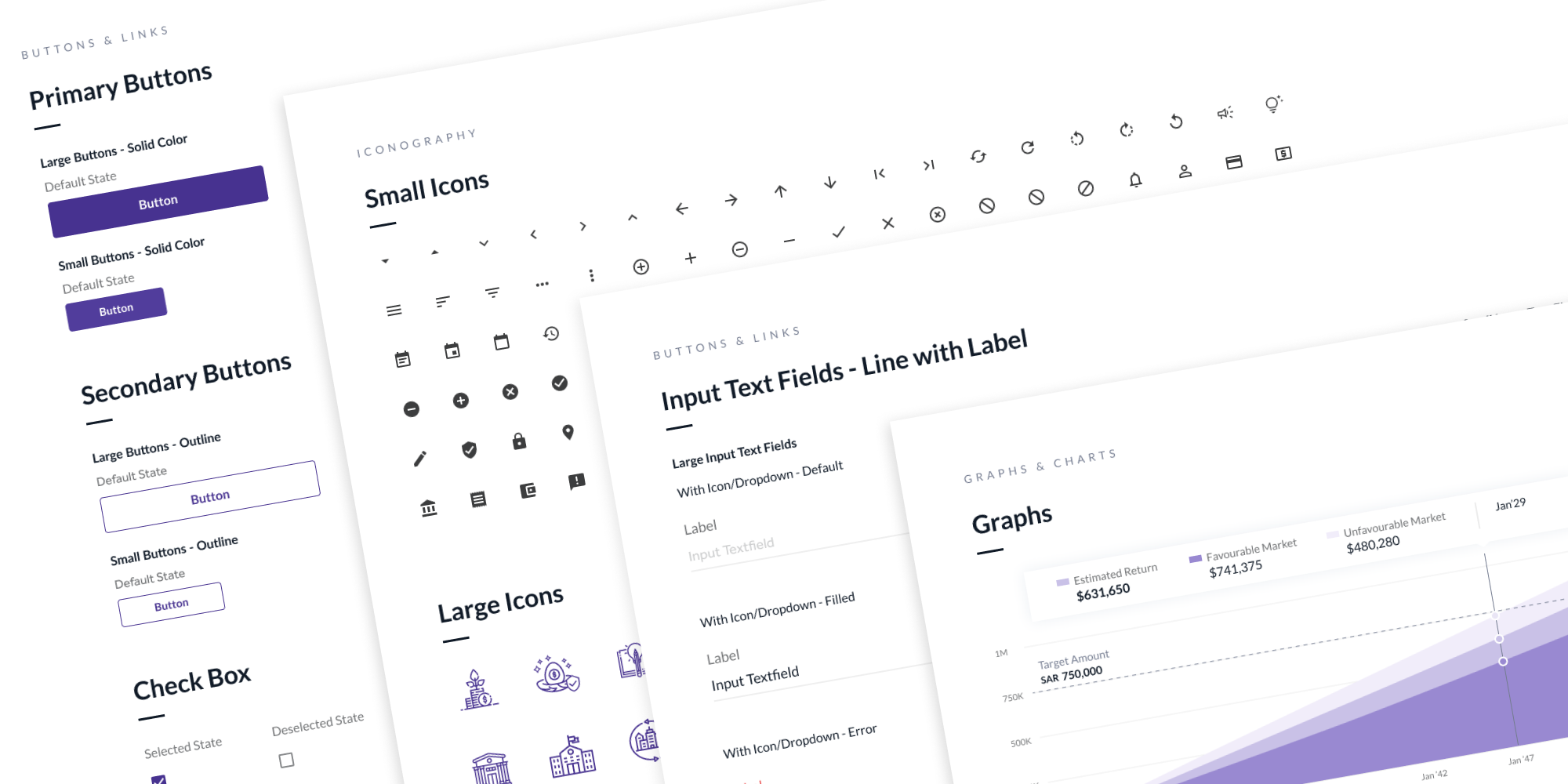
Material UI guidelines were followed, utilizing material icons as the foundation for generic interface icons. Additionally, a set of large icons was created specifically for the goal-based investment flow, with colors and iconography style customisable to match each client's digital brand guidelines.
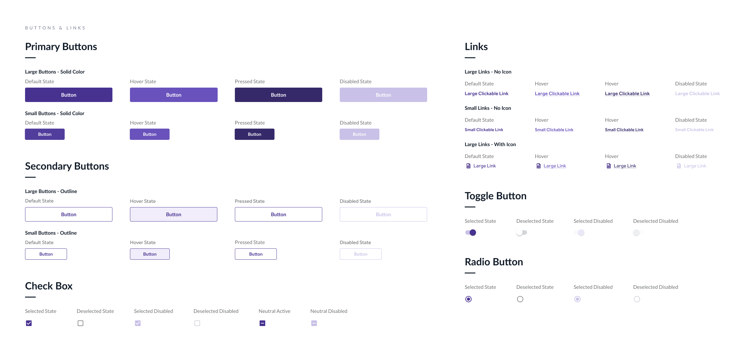
Buttons, links, and checkboxes were designed with multiple states to accommodate various use cases. Color styles applied to these components facilitate rebranding by adjusting the primary color palette.
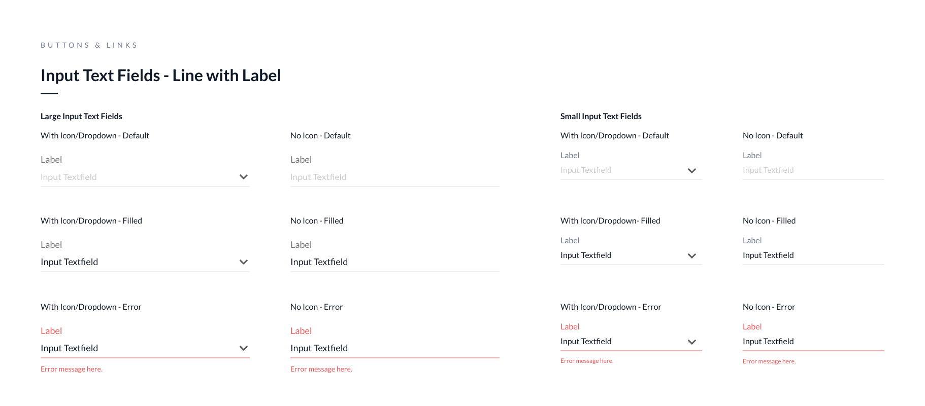
The input text fields are designed with multiple states to suit various use cases. They are componentised for ease of customisable to align with the client's digital brand guidelines.
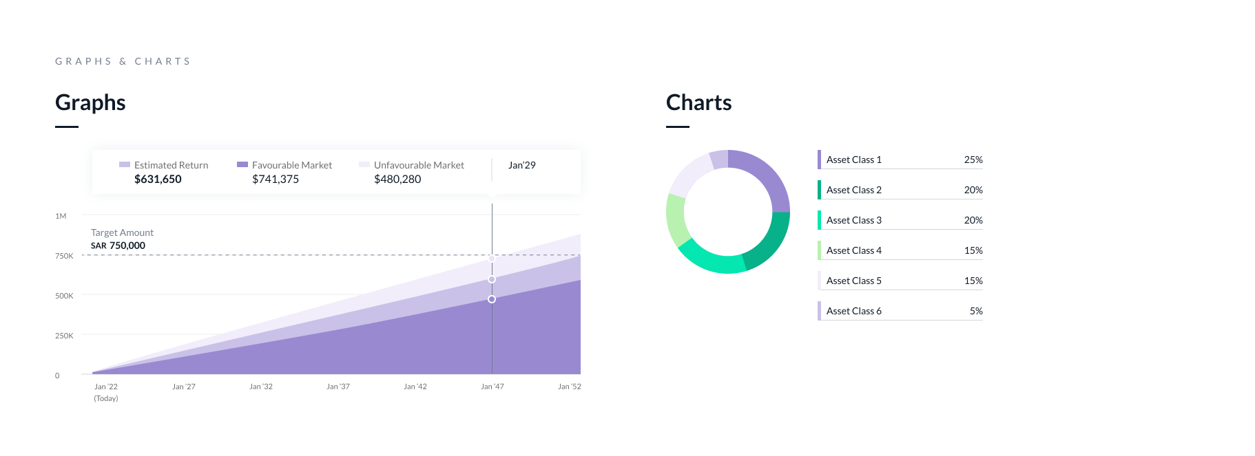
Graphs and charts are tagged to specific colours. Rebranding is achieved by adjusting the color palette of the graphs and charts.